CORAL CRIB
LOGO DESIGN
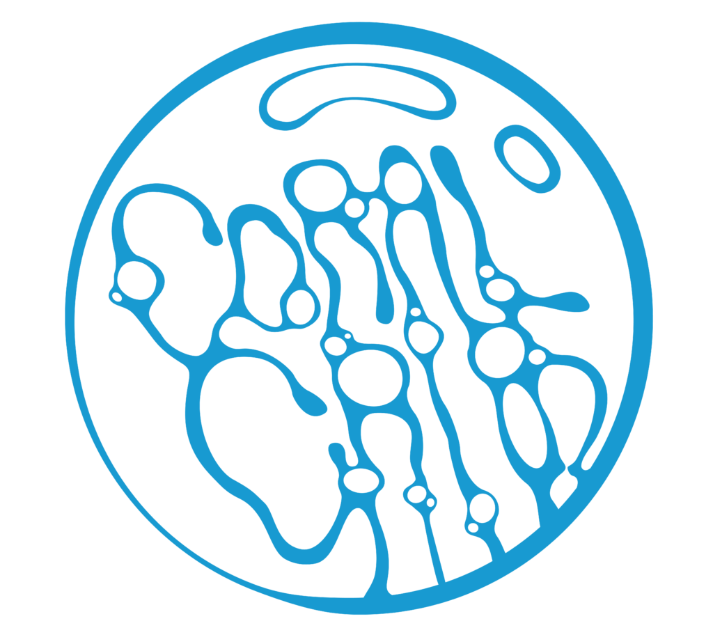
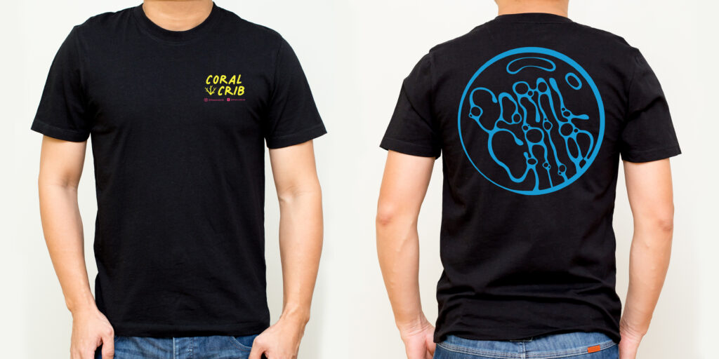
One of my initial logo design clients was Coral Crib, a fish store based in Illinois. They granted us full creative freedom in crafting their logo, to utilize it for t-shirts. My concept for the logo involved encapsulating the store’s name within a bubble, aiming for a distinctive appearance that would appeal to customers. The choice of neon colors was inspired by the blacklight effect produced by reef tank lighting on such hues. However, the final design proved somewhat challenging to read. As a solution, I placed the bubble graphic on the back and opted for a simpler typographic logo on the front.
Although the end result didn’t entirely meet my expectations, I acknowledge it as one of our initial endeavors. In hindsight, I would have streamlined the back logo and aimed for greater cohesion between the two designs.


